Norway or bust - 5000 kms of bliss (Part 1)

It was only a question of time before me & wifey decided that it was time for another decent road trip and we wanted to cross off the final Scandi country we’s not visited/traveled too. That country was Norway.
A bit of forward planning was a must for us as we were heading there out of the normal touristy seasons and on the back end of their winter. This time period for us proved to be the best choice we’d ever make. Please read on and you’ll see it all panned out..

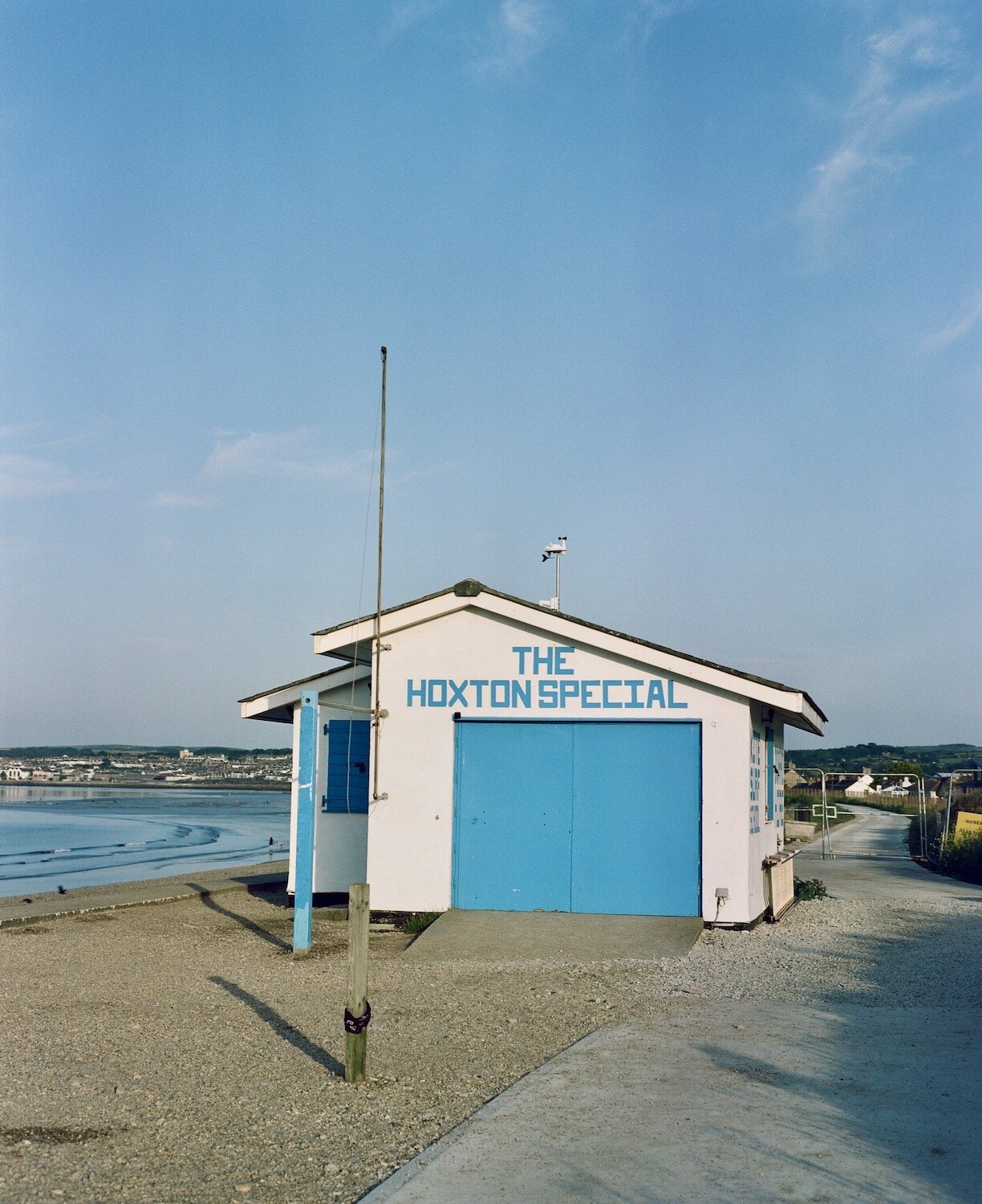
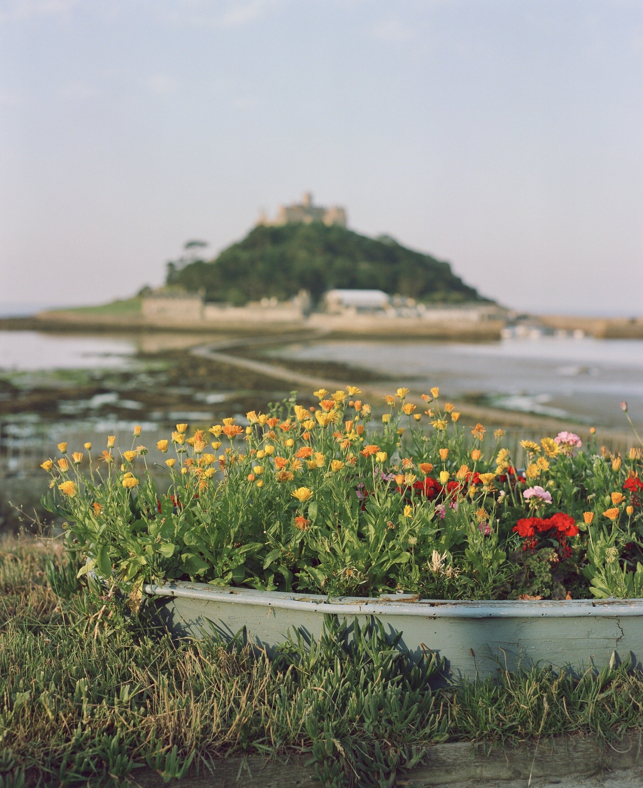
So, the route. We live in Marazion, 50.1251° N, 5.4640° W, thats 20 miles from the most southerly point on mainland Great Britain, 49° 57' 30" N, Lizard Point, so some element of our route to get us to mainland Norway needed pre planning. It started with a ferry trip across the channel into Ostend, a few further hours driving up to Eemshaven, then an over night ferry to Kristiansand. Once we arrived Kristiansand, we had no further plans as such other than to drive and see where it takes us.

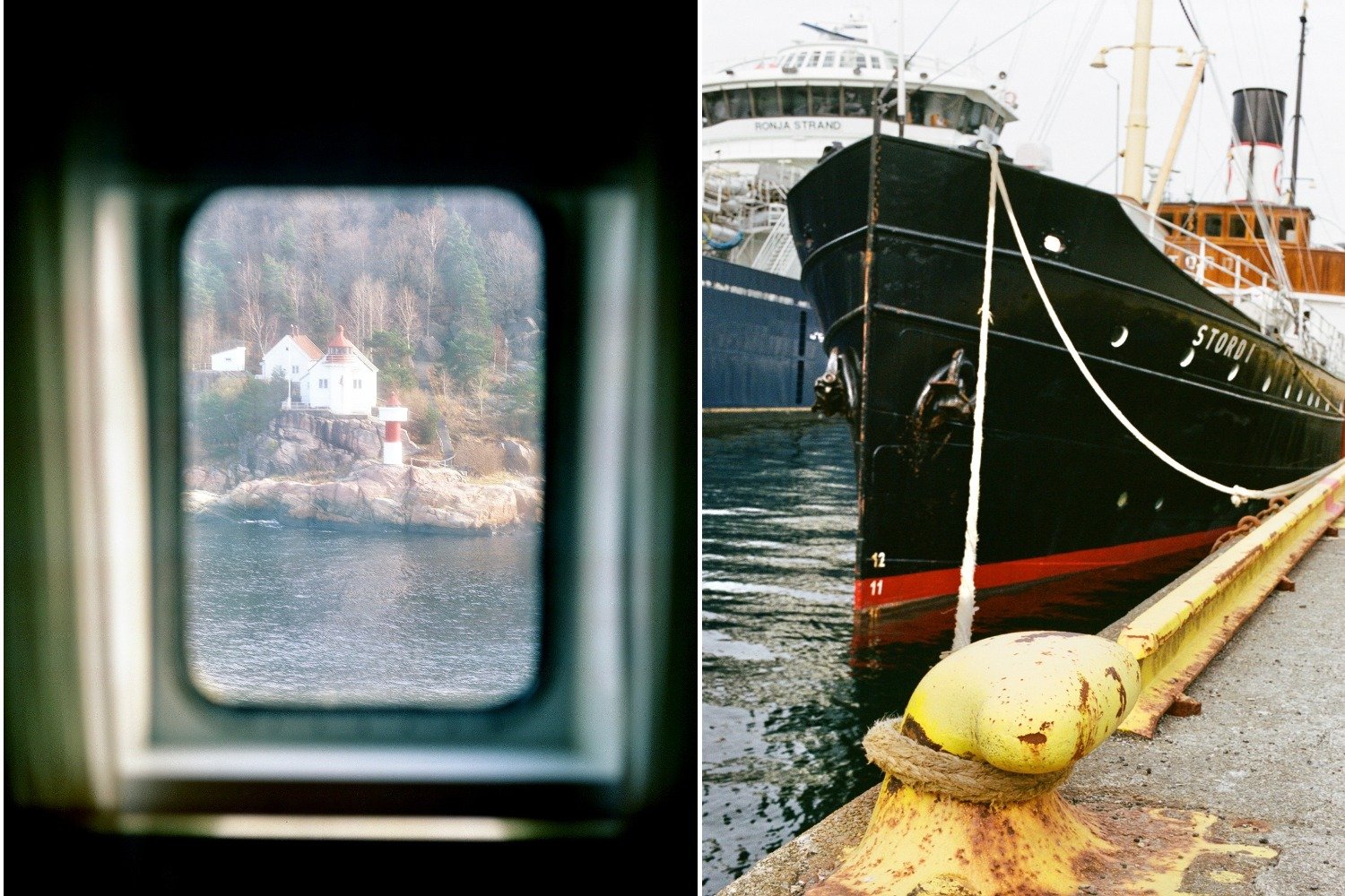
When Im travelling anywhere, or anywhere at all really, Ive always got my cameras with me. As a photographer, I’ll always find something to shoot but never any of those dreadful standard tourist type shots we so often on IG. Coming into port for us meant that this was the real start to our trip.

So the first thing that struck us within driving for no longer than 20 minutes or so was just how empty the place was. It was like a Sunday morning before anyones up, but this continued for hours. Here and there we’d see the odd car but there was no one about at all, sort of a ghost country you might say

to be continued……

Grainery vs Newgrain

As photographers, we all remember many years ago the first real introduction of a place where we could share our photo’s with the world, that was Instagram. Since then, it was bought out by the greedy Yank and his mates and the shift on photo sharing as such has long gone in favour of money and making as much money as possible. I refer to their ad’s, reels and full on advertising which photographers like myself have no interest in. So what are the others choices for us photographers these days who don’t see Instagram as the future of sharing. Well, here’s my findings

First of all, let’s take a look at Grainery first. Here’s an app, and a desktop version too, thats been designed with us film photographers in mind. No digital here thank you. The developer is a guy call Kyle Johnston. He launched back in 2022 with great intensions Im sure to develop it further but as its progress over the years on the r&d has fallen flat. No improvements, no real shift in its flexibility just pretty static if Im honest. Don’t get me wrong, any new photo sharing app is a blessing in relation to Instagram. In Kyle’s defence, a one man operation such as his, with a limited pot of money is going to suffer, and it has.

Im not a smart phone user but Im told that its a bit glitchy to say the least. On a desktop, there are some issues there too but its still a great way of displaying your photo’s. There are of course some similarities to the Instagram’s design and lay out but that works.
So, two years down the line, Kyles not really moved forward to a degree. There is no support with this app, and I mean, no support.

Whats the future for Grainery. I guess we’ll have to wait and see…

And so we move onto Newgrain. Here’s an app, and a desktop version soon, thats is the brain child of founded by Tim Issenmann, a passionate film photographer himself. He launched in early 2023 and its content is building at speed, just as did Grainery in its early days. However, what seems to make Tims app a little more robust is the fact that it’s not just him working on it and I understand he has some funding behind it. So when it comes to the r&d and development front, Newgrain is always going to be ahead of Grainery.

For me personally, Newgrain already has the edge. It is always about what suits you best I reckon. Im not going to go into the in’s and out’s of costs, which are part of both these app’s. You can have a look yourself and make your own judgement.
Here’s something to remember though. Photographers such as myself are moving away from that greedy little mans platform and looking for something different that has one main goal in mind, sharing images alone. RD

Kodak Instamatic - the results

Some time ago, I picked up a Kodak pocket Instamatic 100 at a local car boot sale, put a roll of film through it and here are a few of the results, finally. Sorry for the delay.

Firstly, a little background on this little point and shoot fella if I may. It’s a very basic snapshot camera that introduced the 110 format. This format is still available from those lovely people at Analogue Wonderland, both black and white and colour. The spec on it is a 25mm lens, f/11 Triplet shutter, shots at 1/60f with a developed image size of 13 x 17.

With all that in mind, here a just are just a few of the images I took with it.

Yes, they are grainy! What would you expect from a tiny plastic lens. Remember this, its a very basic point and shot compact film camera of the period, the 1970’s. I wasn’t expecting anything less than heavy grain. But here’s the thing, the camera handled colour well and Im happy with the results. They do have a period look to them if Im honest which is rather engaging.

So, the conclusion of shooting a roll of 110 for me with this little fella was all about having a bit of fun. I love to see how old cameras and formats look today and in some respect they looked like they did the 70’s, when the only choice was film. Today on the photography front, it all seems to be all about how sharp your image can be rather than value as an image. Would I use it again? of course I would. RD

Shooting Kodak Vision 250 3 D


For those of you who are uncertain as to what Kodak Vision 3 is, its a 35mm colour negative film originally made for motion pictures. The film's standard development process is ECN2 and Im told it can also be processed using the C-41 process. Double check that. I chose to go down the ECN2 route which is more costly one and you’ll need to search out someone in the UK who does specialist processing. I used Nik & Trick ( www.ntphotoworks.com), excellent service I might add. You’ll need to wait a little longer than the standard 2/3 days turn around time on this stock though. Factor in say 2/3 weeks to get your shots back.

So, the first set of images here are from the first roll I shot. I had no real subject matter in mind at the time other than to just roll off the film at whatever

Camera: Konica Hexar

Roll 2
On this occasion, i looked for more variety and colour to further test this stock and I found subjects that it suits, and perhaps others that it doesn’t. For me, the portrait shot below is fine in its composition but I can see yellow and slight green ish tones to it.
Given I know the subject well, the skin tones and studio walls colours, are not correct.

Further evidence of those yellow and green ish tones are highlighted here when I shot this image in low light conditions. The film was shot at stock and the light reading was fine, its just Vision3 that gives it these tones especially in low light

So, is it a stock Id shoot again? Hell yes! I like the fact that Vision3 for me seems to offer colours and tones that other stocks don’t as such. It’s never going to be one of my top 5 stocks but I will continue to shoot it

Please note: All of the images contained within this post and other posts, and on my site are free from Photoshop, Lightroom and presets. All my imaging is real

We're now fully branded #YHTBG

A project Ive been putting together for some time now is finally coming together nicely. The “You have to be game” project was an idea I had some time ago and has been gathering pace over the last 18 months or so. The concept is there as is the design and it’s lay out, thanks Olivia. One thing for me though was missing, and element to bind it together from a branding point of view, a logo.

Some might say that why would a print publication need a logo in the first place. Well, having a logo makes a strong first impression, it grabs attention and its the foundation of the your identity. This for me will ensure that this publication stands out from then rest and creates our design ethos. A big thank you to Tom for putting this together


Jaywick - a positive view

Ive heard a lot about Jaywick in the national press over the years for being labelled as 'Britain's most deprived place'. It seemed to me that the press have been rather judgmental and very negative towards Jaywick so I felt to need to see the place for myself. Judging by the on line content Id viewed, there seem to be a very similar look to the place in terms of imaging but I was sure there was much more to see that just broken down homes etc

Let’s be honest here and I think Im fair in saying “an Englishman's home is his castle” and thats what the residents of Jaywick have here. They might not be built out of stone, but its a place they call home surrounded by their own tight little community.
The first surprise for me was the beach. An expanse of sand with a well establish Beach hut going back to the 50’s

There are elements of council lead design to add colour and features to the town alongside the local residents who add there own little spin on their chalets, sorry castles, along the sea front. All little touches that mean so much to them in a place they all call home

There’s even a beach patrol and seaside awards for Jaywick. So, Its not all doom and gloom here and there are some very posItive aspect to Jaywick. They’ve had a really bad time in the past press wise but I hope my spin on it is nothing other than positive from my cameras point of view. RD

All of the enclosed images were shot on medium format & 35mm. No digi here thank you

New Kodak Gold 120 200 review

Since the recent launch of the new Kodak Gold 120 stock, Ive been looking for an appropriate subject matter to shoot it with, both on 6x6 and 6x7. Colour wise for me , Cadgwith fits the bill 100%. It’s one of those quintessential colourful Cornish fishing villages that has it all. Granite old school Cornish cottages, thatched roofs, pastel coloured boats, glorious views and the Atlantic ocean pushing into its sheltered cove

The colours look great for me and Cadgwith certainly delivered on the colour front. Early doors is always the best time to shoot these locations. On reflection, Im pretty happy with Kodak Gold

The new Kodak Gold 120 seems to sit somewhere between Portra 160 and Ektar I reckon. Maybe not so vivid perhaps as Ektar and not so neutral as Portra but the colours do pop for me, and Cornwall always delivers on the colour front which makes my job so much easier. By the way, Im no expert or a technical photographer in any way but these are my findings, results and my review.

Camera’s used in this shoot: Hasselblad 500 CM/ Asahi Pentax

no PS, LR. Presets, just straight out of the camera at box speed

Please note: other views and opinions are available but these are mine

Kiro 400 review

Id never heard of Kiro 400 film stock before until a friend of mine sent me a roll, free of charge I might add - cheers Jonatas. I reviewed it on line as that what I do with most stocks I’ve not shot before and thought Id give it a go. I did have one narrative in mind at the time but the French buggered that up for me. That was snow! Dam, I still cant forgive those French fops.

Anyhow, Enclosed are a selection of images of different subject matters colour values and different lighting conditions.

Camera of choice: Konica Hexar AF

For me, the colours do stack up and there are some elements of other films stocks to Kiro too. I did read somewhere that Kiro might be a Fuji C200 rebranded stock. Im not convinced of that if im honest.

To summerise then, Kiro 400 is a solid colourful 35mm stock, not of the finest grain of course but it works under variable light and conditions. Would I shoot it again? of course. Remember, shooting film is all about grain and loving the grain, not those dreadful pixels things - #embracethegrain

Please note: All of the images contained within this post and other posts, and on my site are free from Photoshop, Lightroom and presets. All my imaging is real .

Other opinions are available

Kodak Professional Portra 160NC review

Here’s a Kodak film stock that I only came across recently and being a lover of Portra in general, I simply had to try it.
I shoot a lot of Portra both on 35mm and medium format but I wanted to try NC on my 6x7 first, just to gauge it on a large negative fit. By the way, this roll of NC expired back in 1998.
I first picked a solid colour subject matter to see how it stood up. You’ll notice here that there is four blues, the double doors, the side shutter, the sea and the sky. All different shades of blue. To my eyes, there’s not colour separation at all and NC has performed really well given the fact that its over 20 years old

The next image was shot early doors just as the sun was coming up positioned slightly behind me. I picked this frame as I thought it would best represent a series of colours for a decent Portra test. Again, I think the film stood up really well the colours to me are classic Portra, perhaps more 160 than 400

medium+format_film_cornwall_rick_davy.jpeg

I think it’s important to note here that I don’t use Photoshop, Lightroom or filters. I still struggle to understand that if you’re shooting film, you take all that time to compose the shot, get your light levels, shutter speed etc, you then take that image and change it, add and manipulate the hell out of it. If you shot it wrong in the first place, go back and do it again or learn from your mistakes.

Again, the colours here for a well expired film look really good and they are as I saw them. Clearly previous storage on his roll has been good or at least been kept away from heat etc.
On balance then, If i can get hold of some more of this stock, I certainly would. Its clearly Portra both on the quality and the colour front.

Please note: Other views and opinions are available but these are mine. Cheers….